Color and Its Impact on Printed Communications
Color has the power to invoke a variety of responses from consumers and is a critical marketing tool for building a brand and winning customers. Adding color to printed transactional and promotional communications can highlight important information, make advertised products more attractive, and improve response rates. While the added value delivered from color printing compared to black & white is often difficult to quantify, recent research from InfoTrends makes a compelling case for the power of color.
According to preliminary data from a new InfoTrends survey–Customer Engagement Technologies: State of the Market—businesses that invest in printed communications overwhelmingly believe color to be a vital component of their print communications. About 61% of firms reported that color was very important in transactional documents, while 63% indicated the same for printed promotional materials. These companies reported that using color in their printed materials generated a higher ROI, strengthened brand image, and made documents easier to read and review. Many also noted that since their competitors print in color, they must do the same to keep up with the competition.
Historically, direct mailers and transactional communication service bureaus have digitally printed in black & white and relied on offset printed shells to provide color design elements such as logos, highlighted text, and tints. In recent years, variable color printing has enabled these providers to eliminate the use of pre-printed offset shells while simultaneously leveraging full-color personalization to improve response rates. According to InfoTrends’ research, businesses that plan to add variable color to printed bills and statements believe that doing so will improve the customer experience (62%), improve brand perception (59%), and increase the effectiveness of marketing messages (55%).
Although color is certainly effective for a variety of marketing initiatives, it can be overused. Designers often advise using color moderately and strategically because overusing color can undermine its effects. For example, too much color in a transactional document can negate its ability to highlight important information or direct the reader’s attention to a specific call for action.
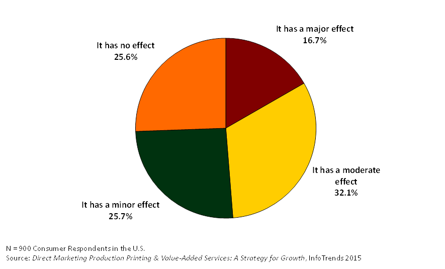
Strategic use of color in direct mail often leads to improved response rates. Full-color images can capture a consumer’s attention with realistic depictions of advertised products. Color can also be used to personalize messages by matching pictures or text to items that the customer has purchased in the past. Furthermore, as shown in the Figure below, nearly 49% of consumer respondents reported that seeing color on an envelope had a moderate or major effect on their likelihood of opening it.
Figure 1: How does the use of color on a direct mail envelope impact your likelihood of opening it?
While color is an important component of the success of mailed communications, it’s important to remember that it’s only part of a larger direct mail communications strategy. For example, a key determinant of success is focusing an offer toward the best possible prospects—ones that are selected through robust data analytics and addressed with targeted, relevant personalization. Color works best when it is used in concert with an attractive design, an appealing offer, and personalization. Printing in color can enhance other elements and assist in maximizing the return on investment, but it can’t be used in isolation.